Reviewing Visualizations
Whenever you generate a report from the main menu, you're taken to that report's visualization, if it has one.

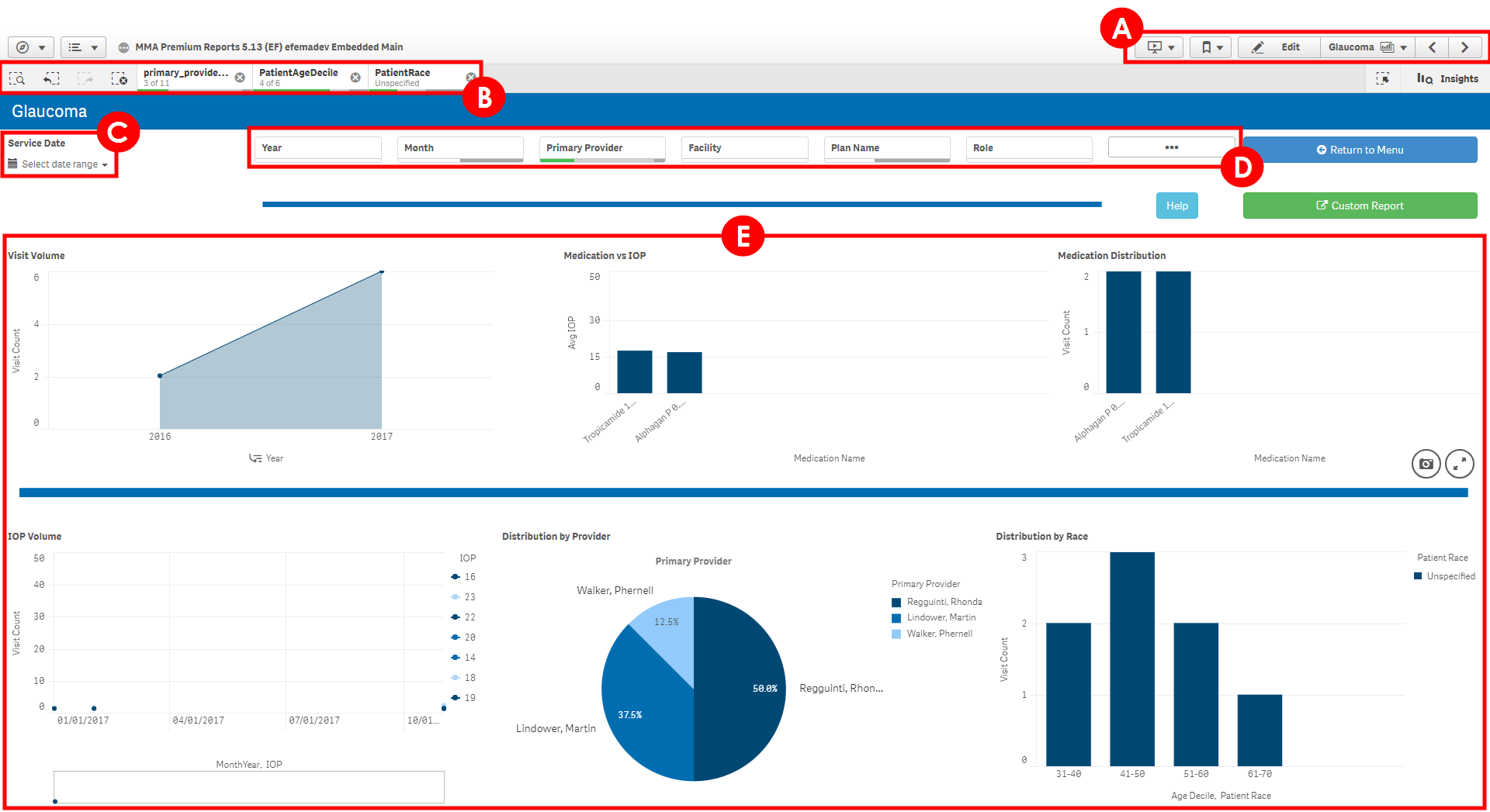
Each visualization has the following key sections:
- Navigation Bar. Enables you to navigate through Analytics using the forward and back buttons or the drop-down list. You can also bookmark reports and create stories from here. For more information, see Bookmarking Reports and Creating Presentations Using Stories.
-
Filters Toolbar. Displays the filters that are currently selected. Filters enable you to narrow a report down based on factors such as time, provider, diagnosis, and more. The buttons on the left allow you to search for filters, undo or redo a filter selection, or clear all filters you've selected. You can remove a single filter by clicking the x on that filter.
Just like sticky fields throughout the rest of Encompass, filters remain "sticky" even after you navigate to a different report.
-
Date Selector. Enables you to narrow down results based on a range of dates.
-
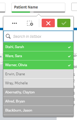
Filter Lists. Clicking on any of these buttons reveals a drop-down list of filters you can select from. When you select a filter from the drop-down list, it's added to the Filters Toolbar.

Selected filters are highlighted in green. If a filter is highlighted in dark gray, that means there's either no data associated with that parameter or it conflicts with another filter you've already selected. For example, when you select "Female" as a filter, the names of male patients will be grayed out to indicate that they currently fall outside the parameters of the report.
Click the green check mark button at the top of the list to save the filters you've selected or click the red x button to close the list without saving your changes.
-
Visualized Data. The graphics that appear here vary depending on what report you're viewing. Hovering your cursor over a graphic reveals additional options, including a button that expands the graphic to a full screen view. You can also filter data by clicking directly on a visual such as a section of a pie chart or a plotted point on a line graph.
You can view the raw data behind a chart by right-clicking it and selecting View data. To change it back, right-click it again and select View chart. You can also view the raw data for an entire report by clicking the Custom Report button. For more information, see Reviewing Custom Reports.